How we created dynamic, accessible color palettes.
Randomly Accessible
As good a11ys (accessibility-focused developers, for those of y'all unfamiliar with coding lingo), accessibility is important to us in all of our work. But when we create a site called Make A Daily Difference, with 365 ways to do good in this world, it's doubly important that everyone be able to comfortably read and act on the content. Our designers design with this type of web accessibility in mind, but what if you wanted to have a dynamic set of colors, without having to manually calibrate each one?
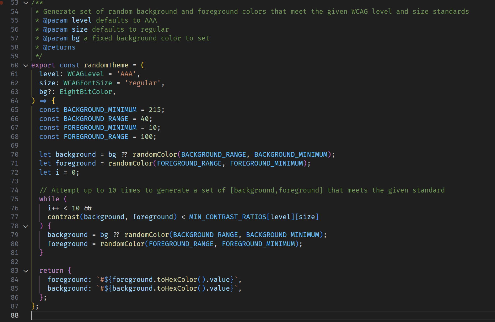
The Web Content Accessibility Guidelines (WCAG) sets standards and establishes best practices to ensure web content is accessible to people with disabilities, including those of us simply getting on in years (health is temporary!) To ensure text is comfortably legible for all, these guidelines specify the minimum amount of contrast that text must have against its background. Contrast makes text easier to read. And smaller text must be even more "contrasty" than larger text. We wanted to meet their highest standard, AAA, while also having a new, random-ish set of background/foreground colors each day.
This was a challenge because, while there are many tools out there to tell you the contrast ratio between two colors, there are very few that go the other way. In other words: "given text of some color, give me a background color that would be sufficiently contrasty." Necessity being the mother of invention, we repurposed a few off-the-shelf tools to do just this.
First, we found a nice little library that would make working with colors easier. Second, to allow us to art-direct the style, we wrote some functions to generate random colors within a given range. Finally, we put them all together with another function to analyze the amount of contrast in each pairing, and shuffle until we get a match. This bit of retrying is necessary as contrast is not a simple matter of dark vs light; colors influence the way we perceive contrast, so for example a yellow might be more difficult to read than a blue of the same brightness, against the same background color.
We may evolve the above into its own module that others may use, but in the meantime this is an approach that has worked well for us, and we hope others will find it useful. Though to the perfectly-sighted person the difference between an accessible palette and a close-but-inaccessible one may seem minor, to those who need it, it's the difference between your site being comfortable vs being a headache, or even unusable at all. Just another way we try to make a daily difference :wink: